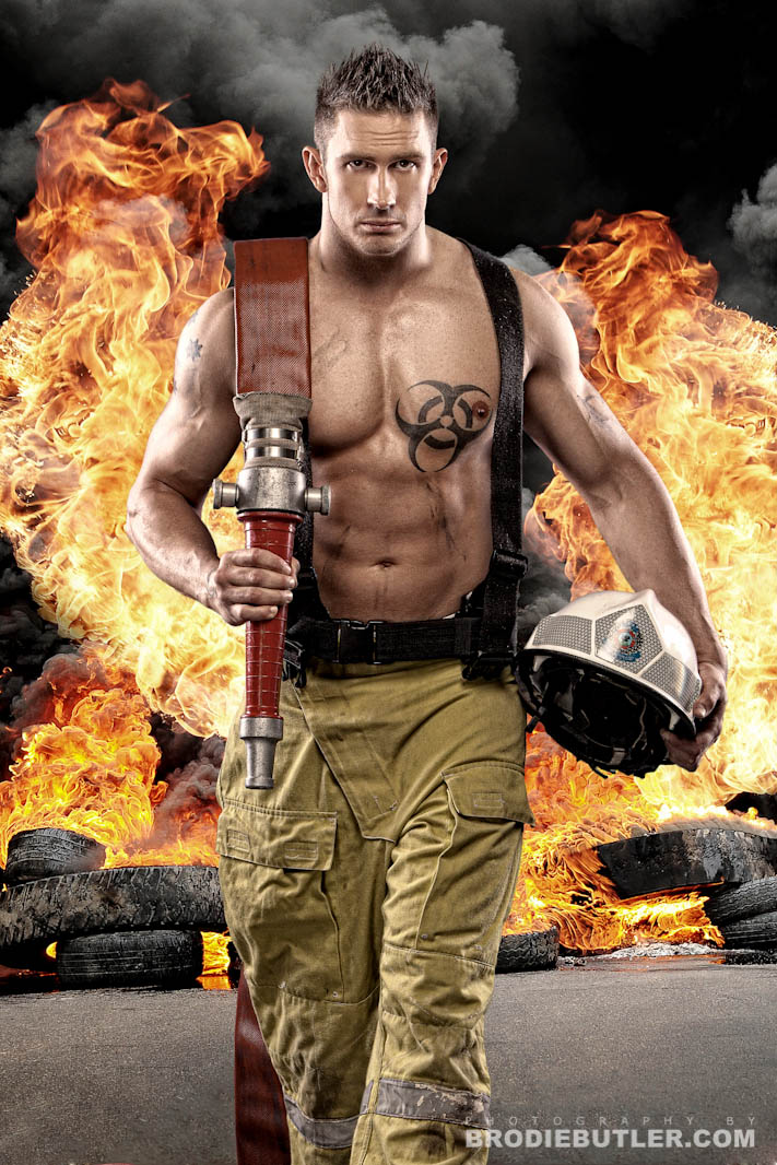

Here’s another one for the ladies. This is Chris Skidmore from Top Shelf Entertainment being super cool by walking away from an explosion. (You must watch this – Cool Guys Don’t Look at explosions). The irony here of course is that he is supposed to be a fireman, running towards the fire, but we’ll forget about that minor little detail in this case. This was a photoshop composite created for the freshly built Top Shelf Entertainment website. It’s one of my favourite images and here’s a little bit about how I did it…
The diagram below briefly explains the setup.

The main difference here is that I actually setup a grey background for the fireman image, which isn’t reflected in the diagram above.
Here is a before and after image giving you a better idea of how it was done. I decided to crop the bottom of the hose out since it looked rather silly not connected to anything, and I really wanted to get in as close to the subject as I could. Notice how I cropped him just below the knees. It’s always important to never crop a model subject at their joints as it looks really awkward.

Photoshop Composite Tip:
Now here’s one of the crucial secrets to creating composites that I see people miss out time and time again. It’s probably something you have wanted to be able to do but didn’t quite know how. The trick is, to match the colours between your subject layer, and your new background layer. Simple right? It is. You need to make sure your subject is going to fit in properly with the new environment and matching the colours of the two layers so they blend is the key to doing that.
Here’s a very brief run down on how to do it. Select your subject layer, in my case the layer with the fireman. Then go to Image -> Adjustments -> Match Colour. Once the dialog pops up, you can select the source document and then the actual source layer which is going to be your new background layer! In the example below the name of my explosion/fire layer is “BG to match” so I could find it easily. You can see the preview of that layer in the little preview window to the right.
Then you can play with the sliders in the Image Options section to adjust how much it affects your image. Have a play with it to see what looks best. Thats it! It’s so simple, but very very effective and I don’t think I have ever done a composite without using it.

B.